Consolidation – 5 sites into 1
Facilitated workshops with the organisation was required to identify what pages and sections could be grouped under what headings while ensuring usability and accessibility of content was not impacted.

Development of the Information Architecture (IA)
After the completed workshop and several additional discussions and iterations, a logical, user friendly and functional sitemap was agreed upon. Presented as a visual workflow, the customer was able to clearly understand the structure and how the user would access content and browse the site.
Wireframe concepts
Due to the limited timeframe of the project, the development of desktop only wireframe concepts was achievable. Ideally, Tablet & Mobile concepts would be included in the lifecycle of the project.
Wireframe concepts are developed to assist the customer with visualising the structure, layout and element placement of the concept before detailed design concepts & UI work is started. This ensures the detailed design stage of the project has a clear structure to work within and time is not invested on a concept that the customer does not like (resulting in time & budget wasted).
The wireframe concepts were uploaded to InVision and configured to allow the customer to ‘browse’ using hotspots and tooltips. The functionality of InVision assists with communicating the desired user flow by allowing the user to click-through concepts with the same functionality of an interactive prototype.
Homepage wireframe concept

Inner-landing ‘Tile’ page wireframe
Part of the project brief included the desire to avoid using drop-downs or a mega-menu from the main website navigation. This proved to be a challenge as the site IA was somewhat complex and extended past the standard three-levels deep. The solution – to utilise an automated navigation module but not just display the next level down, display the next level PLUS any direct decedents. This allowed the user to choose whether they want to go the long way (with more clicks) or straight to the nested child page. The implementation of displaying child and nested child pages on the one tile effectively allows the user to bypass pages and get to the content quicker.

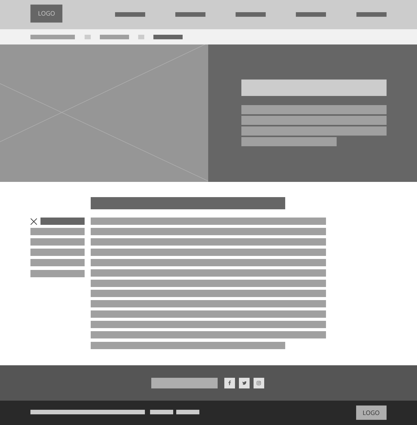
Inner-content page wireframe
When conceptualising the standard inner-content page, I wanted to ensure the main content on the page remained the primary focus (content is king after-all). In so many sites, you see additional snippets of information or cross-links which can ultimately clutter the layout and detract from the content. To assist with ensuring content remained the main focus on the page I opted for a closed page relative sidebar navigation. This allowed the main content to capture the users full attention while the use of globally recognisable icons including the hamburger (represents navigation) and share (for social sharing to your preferred network) allows the user to perform additional functions including expanding the page menu to access other relative pages in that section (effectively allowing the user to browse the website).
Course list wireframe
One of the service offerings provided by the organisation is accredited and non-accredited training. The ability to display the multitude of courses plus allow the user to register, view the course details, contact staff and access any additional useful information was key requirement with the objective of increasing registrations and/or course enquiries.

Course details wireframe
When a user clicks to view the details of a particular accredited course they are presented with the full details along with a direct link to training.gov.au via the relevant course reference, the associated modules and assessments and direct access to register with the association. The sidebars will also stick to the top of the screens when the user scrolls past to a certain location using jQuery Waypoints. This ensures the user can access the page relative navigation and social share controls as well as the register, download pdf and contact CTAs in the right sidebar.

Team list wireframe
The concept of a filterable team list based on categories, groups or departments was an obvious choice considering the new organisation is a result of joining five individual businesses. The user would see a list of all team members but then have the ability to filter using colour coded pills above the team listing.

Design concepts
The wireframe concepts were presented to the customer via InVision along with a short description for each of the layouts and an outline of the proposed functionality. The concepts were approved which allowed for the next phase of the project to begng – the creation of detailed and finished (UI) design concepts based on the approved wireframe concepts.
Homepage design concept

Inner-landing ‘Tile’ page design

Inner-content page design
Course list design

Course details design


